16+ Spider (Radar) Chart Templates (PowerPoint, PDF, Word)
A spider chart is a way to display the data visually in an efficient way. It is a way of comparing different quantitative data graphically. Spider chart templates are used to see the difference between multiple variables easily in a more understandable way. You can download free spider diagram PowerPoint templates and get these printable and editable spider chart templates in other formats that you prefer. Below we share a complete guide of spider charts that helps to make your presentation flawless.
Table of Contents
What is Spider Chart?
[adinserter block=”5″]
If you want to make your presentation solid, then a graphical representation of your business is the best way to do everything clear and understandable. Spider chart is one of the best approaches to display your data and figures of multiple variables that are easily understandable by every person. Spider chart is also known as polar, radar, and web chart, sometimes it is also called star plots. It is easy to work with templates available in document and image formats. These radar chart templates are available in PDF, PPT, Word, Excel formats; you can also find it in google docs.
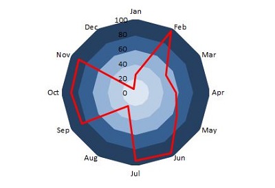
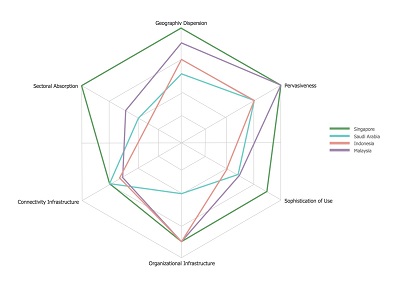
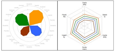
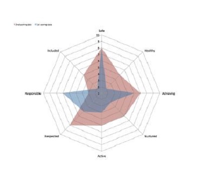
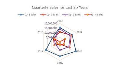
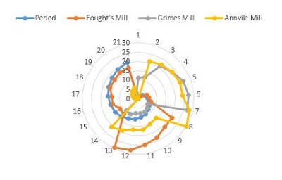
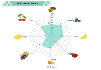
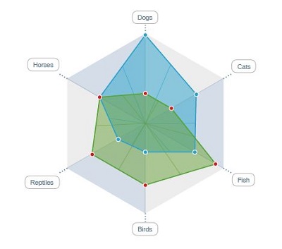
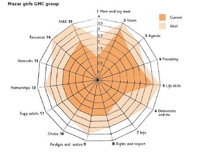
It is used to compare the multiple variables which start from the center point and are represented on the axis. A group of values is plotted on the axis, which starts from the same point and plot with equal space. Group of values the same multiple variables are plotted on it, and each variable has an axis. The values of each axis are plotted on it and connect these points to make a polygon. You can see the spider diagram example and download the templates of it. With the help of an example, it is easy to create a useful chart to display your data.
[adinserter block=”1″]

[adinserter block=”1″]
When to use a spider chart
Every person wants to make things clear that can be easily understandable for every person. When you want to make comparisons in multiple common things, then spider charter is the best option for you to distinguish the values of each variable clearly and concisely. It can be used in different fields of life. Some of these are as follows
- When it is hard to represent the complex data, then the spider chart is the way to display your data more comprehensively.
- It is also helpful to figure out the performance of every employee in a company or organization. With the graphical representation of employee performance, it is easy to understand and help to make better decisions.
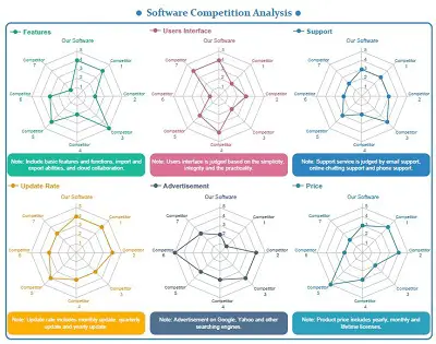
- Spider chart is also the best option in the field of medicines when you compare two or more medicines and find the best one based on their effectiveness. It works as a drug comparison tool.
- It is used when multiple items need to be compared with various features, like finding the best company for different appliances based on their characteristics and efficiency.
[adinserter block=”3″]
How to create Spider Chart in Excel
Spider chart is one of the best ways to represent your data analysis graphically. Browse our collection to download free web diagram templates in word and other formats that work for you. If you want to create your own, don’t worry, we share a few steps that help you to make it more comprehensive.
Step1: Open Microsoft Excel.
Step2: Click the blank workbook; a blank sheet will be opened on the device screen.
Step3: Enter the data in the rows and columns. For example, if you want to analyze the skills of every employee in your company, then enter the name of every employee in the column and skills like task completion, attendance rate, problem-solving skills in each row of the first column. Write the score of every employee in their column.
Step4: When you enter all of your data in the workbook, then select the data that you want to enter your radar chart.
Step5: To insert the chart in your document, after selecting the data, go to the “Insert” tab, then click the “Surface or radar chart” icon.
Step6: When you click on the radar chart icon, a list will be displayed on your screen in which three default radar charts are added, simple basic radar chart, radar chart with points, and filled chart. You can select any from these charts; then, the chart will be displayed.
Step7: It is easy to customize it by using different colors, text colors, and making other changes that you want to see in your chart.
Benefits of Spider Chart
Some significant benefits of spider chart are as follows:
- Quick and easy way to display complex data.
- Visually representation of the data helps to understand the things easily.
- Provide great help to manage the project efficiently.
- Helpful to make some critical decisions with precise analysis.